Turning a housing loan app into a confident, human experience.
Qatar Development Bank’s housing loan app served thousands of citizens navigating one of the most significant financial decisions of their lives. However, the app’s core service journeys - requesting milestone payments, managing repayments, and tracking loan progress - were impacted by high friction, weak information hierarchy, and limited status visibility, making essential tasks harder to complete with clarity and confidence.
This project was a ground-up redesign focused on three principles: visual clarity, process transparency, and bilingual accessibility. Every screen was rethought from the user's perspective - not the system's.
The Problem
Dense screens. No hierarchy. A stressful process made worse.
The existing housing loan app presented users with data-heavy screens that lacked clear visual hierarchy. Key actions were buried - making an already stressful financial process even more overwhelming.
Cluttered Login
Decorative background reduced readability. Multiple competing elements with no clear entry point.
Data Dump Dashboard
Loan data in raw table format with no visual separation between critical and secondary information.
No Clear Navigation
Users relied on a hamburger menu, adding friction at every step.
Unclear Payment Flow
The disbursement request process lacked step-by-step structure - no sense of progress.
Inconsistent Typography
No heading hierarchy - text sizes competed visually, making screens hard to scan quickly.
Research
How We Identified the Right Problems
Without formal user research sessions, discovery was grounded in three inputs: a structured audit of the existing app against established usability principles, conversations with QDB's internal product team about recurring user complaints, and a review of regional banking apps to benchmark how similar loan management flows were handled elsewhere.
Three consistent themes emerged:
01
Users had no visibility into where they stood
The milestone journey had no progress indicators. Consultants reported regularly receiving calls from customers asking what happens next - a clear signal the interface wasn't communicating process status.
02
Data was organised for the system, not the user
Loan figures were presented in raw table format - the way a database outputs information, not the way a person needs to read it. Critical amounts competed visually with secondary data, making quick comprehension impossible.
03
Every core task was buried too deep
Primary actions required 3-4 taps through a hamburger menu. Benchmarking five regional banking apps showed all of them had moved to persistent tab navigation for high-frequency tasks.
Before & After
Every change earned, not assumed.
Each decision maps to a usability observation. Nothing changed arbitrarily.
Screen 01 - Login
Before
old-login.png
After
new-login.png
Decorative background clutters the screen
Two CTAs compete for attention
Language toggle awkwardly placed at top
Clean white background - focused and calm
Clear Customer / Consultant role toggle
Single primary action with breathing room
Removed the decorative background in favour of a minimal white layout. Role selection simplified to a clear pill toggle.
Screen 02 - Dashboard
Before
old-dashboard.png
After
new-dashboard.png
Dense table format - no visual hierarchy
No personalisation - cold and transactional
Hamburger menu hides key navigation
Personalised greeting - "Welcome, Mr. Khalid"
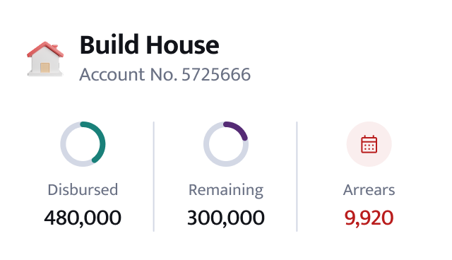
Circular progress rings for key loan amounts
Persistent bottom tab bar replaces hamburger
Introduced personalised greeting and visual progress rings to make loan data feel human and scannable at a glance.
Screen 03 - Disbursements
Before
old-disbursements.png
After
new-disbursements.png
Flat milestone list - no sense of progress
No visual distinction - completed vs pending
CTA buried with no prominence
Progress bar - "4 of 10 milestones completed"
Completed items separated with receipt links
Sticky "Continue to Payment Request" CTA
Rebuilt the milestone view with a clear progress bar and visual separation between completed and pending items.
Screen 04 - Repayments
Before
old-repayment.png
After
new-repayment.png
Repayment schedule buried in a data table
No distinction between paid and upcoming
Amounts hard to parse at a glance
Card-based schedule with clear paid / due states
Colour-coded status chips for quick scanning
Next due amount prominently highlighted
Replaced the raw repayment table with a card-based schedule using colour and hierarchy to make payment status instantly clear.
Screen 05 - Settlement
Before
old-settlement.png
After
new-settlement.png
Settlement figure buried with no emphasis
No summary or confirmation screen
Action unclear - users unsure what to do
Settlement amount displayed as hero figure
Clear breakdown: principal, profit, charges
Single confirm CTA with a review step
Elevated the settlement amount as the focal point, supported by a clean breakdown and a single, confident CTA.
Design Decisions
Decisions that changed the experience.
Each decision grounded in what users needed, not what looked good on a spec sheet.
01
White Canvas Over Decorative Backgrounds
The original login used a heavy decorative image that competed with the form. Switching to clean white eliminated visual noise and let the primary action breathe.
02
Data was organised for the system, not the user
Loan figures were presented in raw table format - the way a database outputs information, not the way a person needs to read it. Critical amounts competed visually with secondary data, making quick comprehension impossible.
03
Validation between User Flows and Key Learnings
The redesigned flows were walked through with internal stakeholders and reviewed against the original task journeys. In informal walkthroughs, participants navigating the disbursement request flow completed the task end-to-end without assistance-a task that previously required consultant support in the branch setting. Feedback from the product review sessions consistently noted improved clarity around loan status and payment actions. Formal usability metrics were not captured as part of this engagement. Outcomes are based on internal stakeholder review sessions and design walkthrough observations.
04
Persistent Bottom Tab Bar
Designed to eliminate the 3-4 tap depth required to navigate between core sections in the original hamburger menu-every primary task reachable in one tap from anywhere in the app.
05
Milestone Timeline for Disbursements
A milestone-driven timeline with clear completed, active, and pending states transforms an opaque process into a transparent journey with a visible finish line.
06
Consistent Type Hierarchy
A strict three-level type scale: large headings for key figures, medium weight for labels, light weight for supporting text. This alone made every screen dramatically easier to scan.
Design System
Colours. Typography. Components. Bilingual.
Every visual decision documented as a consistent, reusable system built to support both English (LTR) and Arabic (RTL) interfaces.
Colour Palette
Primary#198079
Secondary#142A66
Success#1a6b40
Warning#8B5E0A
Error#B91C1C
Black#111111
White#FFFFFF
Typography-Mukta (English) + Almarai (Arabic)
English-Mukta-LTR
H1 Bold · 32/36
Build House
H2 Bold · 24/28
Disbursements
H3 Bold · 20/24
Account No. 5725666
Para lg Med · 20/24
Welcome, Mr. Khalid
Para md Reg · 16/20
Browse collection of villa designs that fits your vision.
Button md Med · 16/20
Don't have an account? Register
Caption Med · 12/16
Account No. 5725666
Arabic-Almarai-RTL
H1 Bold · 32/36
بناء منزل
H2 Bold · 24/28
الدفعات
H3 Bold · 20/24
رقم الحساب: 5725666
Para lg Med · 20/24
مرحباً السيد خالد
Para md Reg · 16/20
تصفح مجموعة من تصاميم الفيلات التي تناسب رؤيتك.
Button md Med · 16/20
ليس لديك حساب؟ سجل
Caption · 12/16
رقم الحساب: 5725666
Components
Buttons
Form Fields
Selection Controls
Checkboxes
Radio Buttons
Role Toggle
CustomerConsultant
Progress & Status
Progress4/10 completed
Progress0/10 completed
CompletedPendingOverdue
Icons-Used in App
Home
Loans
Disbursements
Repayments
Statements
Discounts
Notifications
Profile
Progress
Milestones
Receipt
Qatar ID
Password
Show/Hide
Security
Bilingual
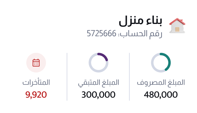
UI Card-Loan Summary (English + Arabic)
User Flows
The moments that matter most.
The disbursement and repayment flows are where users spend the most time - and where the old app failed hardest.
Flow A Requesting a Disbursement
The user checks their milestone progress, initiates a new payment request, reviews the breakdown, and confirms. Four screens, one goal.
Dashboard
1Dashboard
Milestones
2Milestones
Request
3Review
Confirm
4Confirmation
Live Prototype
Tap to interact
5.
Key Learnings
Clarity is a design feature, not a byproduct.
This project reinforced that in a financial context, reducing visual noise isn't just aesthetic - it directly reduces user anxiety and builds trust. Every removed element is a decision made on behalf of the user. The biggest shift wasn't in how the app looked, but in how confidently users could move through it.
From email threads to a structured, trackable system.
Corporate clients accepting a QDB financing offer must submit a specific set of compliance and legal documents before funds can move - a process that previously ran entirely offline, through email and phone coordination with a Relationship Manager. This project digitized offer acceptance and document lodgement into a structured, trackable flow: from reviewing offer terms, to seeing exactly which documents this specific offer requires, to submission and multi-stage review.
This walkthrough follows a real submission pattern from the file - Offer Letter DL9997, term sheet TS-2025-04421 - through acceptance, document lodgement, and multi-stage review.
The Stakes
An accepted offer isn't disbursed capital.
It's a conditional approval. The gap between acceptance and funding is closed by document submission, reviewed sequentially by a Relationship Manager, a Relationship Officer, and Credit Administration. Before this system existed, that gap was managed manually: no standard checklist per offer type, no visibility into submission status, and every correction cycle adding days through email back-and-forth. For a business waiting on approved financing, that delay has a direct cost.
The Checklist
Not a generic list - this offer's exact requirements.
Every document requested is scoped to the specific offer: named guarantors, specific pledge conditions, the exact facility being financed. Six categories make up a typical submission.
Personal Guarantee
Named individuals guaranteeing the total facility limit.
Personal Cheques
Cheques from named guarantors, covering their shareholding.
Pledge (Business)
Business and fixed-asset pledges in favour of QDB.
Insurance Policy
Policy assignment covering the total facility.
Corporate Cheques
Cheques from the named corporate entity.
Other Documents
Decision memo, banking master agreement, T&Cs acknowledgement, and related paperwork.
The Flow
One submission, three reviewers.
A single document submission moves through three sequential reviewers - Relationship Manager, Relationship Officer, and Credit Administration - each capable of independently returning it for correction. The client-facing design had to represent that pipeline honestly, not simplify it down to a single "submitted → approved" illusion.
01
Accept Offer
Client reviews facility terms and formally accepts, with an explicit confirmation checkpoint.
02
View Required Documents
The offer-specific checklist, prepared by the Relationship Manager, appears alongside RO comments and a downloadable reference document.
03
Upload & Submit
Each checklist item gets its own upload slot; submission carries its own confirmation checkpoint.
04
RM → RO → CAD Review
The submission moves through three sequential reviewers, tracked as one dated timeline on the client's side.
05
DL Completed
Once all three stages sign off, the offer's status updates to DL Completed - the same badge language visible across the whole Documents table.
The Return Path
Any of the three reviewers can send a submission back. Rather than a dead end, a returned submission routes the client back into the same upload flow to correct and resubmit - no restarting, no lost context.
Before & After
From Manual to Digital
This flow didn't replace an existing portal - it replaced an offline process. Document requirements were previously communicated through email and phone conversations with a Relationship Manager, with no standardized checklist, no shared visibility into status, and every correction cycle adding days.
Manual Process
Digital System
Document requirements communicated ad hoc by RM via email/call
Offer-specific checklist generated and shown directly in the portal
Structured resubmission - same flow, no lost context
No record of reviewer-specific instructions
Dedicated "RO comments" field with explicit, offer-specific guidance
In Motion
Try the actual flow.
This isn't a screen recording. It's a working simulation of the real flow. Let it run on its own, or click Accept, upload a document, and hit Submit yourself.
portal.qdb.qa/offer/dl9997/documents
Al Ahli Manufacturing
Manufacturing
Insurance
Get support
JM
DashboardDocuments
Machinery and Fixed Assets Financing Offer Letter
Review Offer
Offer valid until 04/01/2026
Offer Letter
Review the details of your offer letter
Facility Details
Ref NumberDL9997
Facility TypeConstruction
Approved AmountQAR 100,000
Tenure20 Months
Note: By accepting this offer, you agree to submit the required documents as specified by the Relationship Manager
Upload Documents
Please upload the required documents to proceed
Document upload functionality will be available after accepting the offer.
Required Documents
Here is the list of mandatory documents to be uploaded
1. Personal Guarantee
Personal guarantee of Mohammed Abdullatif Abdulrahman Al Mana covering total limit
2. Personal Cheques
Personal cheque of Mohammed Abdullatif Abdulrahman Al Mana covering up to his shareholding
3. Pledge (Business)
Pledge over business in favor of QDB
4. Insurance Policy
Assignment of insurance policy in favor of QDB covering total facility
5. Corporate Cheques
Corporate cheque from Al Bandary Engineering and Trading Contracting Co. covering total limit
6. Other Documents
Decision Memo, Banking Master Agreement, and related paperwork
RO comments
Personal and corporate cheques must be dated within 30 days of submission and cover the specified amounts.
Activity
Track the progress of your accepted offer and uploaded documents
Activity will be available after completing the document upload process.
Offer Accepted
06-12-2025
Pending with QDB
18-12-2025
Documents Submitted
14 Documents · 18-12-2025
Document Lodgment Under Review - RO
20-12-2025
Document Lodgment Under Review - CAD
In Progress
Confirm Acceptance
Are you sure you want to accept this offer?
Auto-playing the flow
Walkthrough
The screens that carry the story.
Status vocabulary, the hero checklist, the upload itself, transparency, and how a returned submission gets handled.
01
Documents Dashboard
The entry point - every offer letter in one filterable table, each carrying its own status: Review Offer, Pending with QDB, Upload Documents, DL Under Review - RO, DL Under Review - CAD, DL Completed, Offer Expired, Offer Declined. A client can see exactly where every submission stands without opening a single one.
portal.qdb.qa/documents
DL_01_Dashboard.png
02
Documents Required Hero Screen
The core of the feature: a checklist generated for this specific offer, with a dedicated RO comments field and a downloadable instructions document.
portal.qdb.qa/offer/dl9997/documents
DL_04_DocumentsRequired.png
03
Upload & Submit
Each checklist item gets its own upload slot. Once every required document is attached, submission carries its own explicit confirmation checkpoint before it moves into review.
portal.qdb.qa/offer/dl9997/documents
DL_05_UploadDocuments.png
04
Activity Timeline
Replaces the silence of the old email process - the same status vocabulary from the dashboard (Pending with QDB → DL Under Review - RO → DL Under Review - CAD) plays out here as a dated, readable sequence for this one offer.
portal.qdb.qa/offer/dl9997/activity
DL_07_Activity.png
If Returned
When a reviewer sends the submission back, the client re-enters the same structured flow to correct and resubmit - no restarting, no lost context.
portal.qdb.qa/offer/dl9997/documents
DL_09_Returned.png
Design Decisions
Decisions grounded in a real review pipeline.
Each decision responds to a specific mechanic of how offer acceptance and document review actually work at QDB.
01
Offer-Specific Checklist, Not a Generic Template
The checklist is generated per offer - naming actual guarantors and pledge conditions rather than presenting a static, one-size-fits-all list.
02
A Dedicated Field for Reviewer Instructions
The "RO comments" field carries specific, offer-level guidance - such as cheque-dating rules - directly into the client's flow, replacing context that used to live only in scattered emails.
03
Confirmation Checkpoints at Every Irreversible Step
Both Accept Offer and Submit Documents carry an explicit, undoable-action warning before proceeding - appropriate weight for financially binding actions.
04
Status Visibility Through a Single Timeline
The Activity screen represents the full RM → RO → CAD pipeline as one dated, readable sequence, instead of leaving the client to infer status across three separate silos.
05
Resubmission as a First-Class Path
A returned submission routes back into the same upload flow rather than a dead end or a fresh request - correction is treated as expected, not exceptional.
Validation
Grounded in how the review process actually works.
Formal usability testing wasn't run for this flow. Validation came from working directly against the real RM → RO → CAD review mechanics with QDB's product team, and from the specific compliance requirements each offer carries, rather than assuming a generic document-upload pattern would hold up.
Key Learnings
A confirmation modal isn't UI polish - it's risk mitigation.
In B2B financial workflows, the small moments - a warning before an irreversible action, a comments field carrying a reviewer's exact instructions - carry real weight. Digitizing this process didn't just add convenience; it added a structure and audit trail that didn't exist before, closing the gap between an approved offer and a client actually receiving their financing.
Corporate clients regularly need to pay several beneficiaries in one sitting - suppliers, partners, payroll-adjacent transfers. The existing fund transfer flow only supported one payment per journey: fill in the details, review a summary, verify with an OTP, get a confirmation - then start over for the next beneficiary. For a Maker paying five suppliers, that meant five full journeys and five separate OTP codes.
This project turned that single-transfer flow into a batch one: add several transfers in one sitting, review them together, verify once, and submit once - then track the whole batch through a Maker → Checker → Approver review pipeline.
The Stakes
Every payment repeated the same friction.
None of the individual steps in the original flow were wrong on their own - the form was clear, the OTP step was fast, the confirmation was reassuring. The problem was multiplication. A business paying multiple beneficiaries had to absorb that friction once per payment, with no way to see the set of payments as a single unit of work. That's real cost for a Maker with a batch of invoices to clear, and it made the portal feel like it was designed around a single consumer transfer, not how a business actually pays people.
The Mechanic
Add multiple, review once.
The fix lives entirely in the first step. Transfer Details stopped being a single form and became a running list: complete one transfer, and it collapses into a compact, numbered card - beneficiary, amount, bank, with edit and delete icons - while the same form stays open right below it for the next one. A Maker keeps adding until the batch is actually done, not until the system decides they're finished.
Numbered Entry Cards
Each saved transfer collapses to a summary card with its own edit and delete controls.
The Form Never Closes
Adding another transfer means filling the same form again, not restarting a flow.
One Combined Summary
Every transfer in the batch is reviewed together before anything is verified.
One OTP, Any Batch Size
A single verification code authorizes the whole batch, not each transfer in it.
One Submit Action
The batch enters review as a set, not as N separate submissions.
Independent Status Per Item
Once submitted, each transfer in the batch is tracked - and can be reviewed - on its own.
The Flow
One batch, three roles.
A submitted batch moves through the same governance structure as any corporate payment at QDB - a Maker who creates it, a Checker who validates it, and an Approver who gives final sign-off. Either reviewer can return an item for correction, and the Maker's fix-and-resubmit path had to be treated as a normal part of the flow, not an edge case.
01
Build the Batch
The Maker adds each transfer through the repeater, reviewing and editing entries before moving on.
02
Review & Verify Once
A single Summary lists every transfer in the batch; one OTP code authorizes all of them.
03
Submit as a Set
The whole batch enters the review pipeline together, each item carrying its own status from this point on.
04
Checker & Approver Review
Each role works the same request list with checkbox multi-select - approve, reject, or return several items in one action.
05
Tracked to Completion
A status overview shows exactly who each transfer is currently with - Checker or Approver - until it's resolved.
The Return Path
Either the Checker or the Approver can return an item - but not without saying why. A reason is required before the return is confirmed, and it travels back to the Maker, ready to be corrected and resubmitted alongside any other returned items in the same batch - not one at a time.
Before & After
From One Transfer to a Batch
The underlying transfer form barely changed. What changed is what happens around it - how many times a Maker has to go through it, and what the system remembers between one payment and the next.
One at a Time
Batch Fund Transfer
A full form → summary → OTP → confirmation journey per beneficiary
One repeater session covers any number of beneficiaries
A separate OTP code required for every single transfer
One OTP verification authorizes the entire batch
No shared view of payments submitted together
Status overview shows who every transfer is currently with
A returned transfer meant restarting that one payment alone
Returned items are fixed and resubmitted together, not individually
In Motion
Try it as the Maker, then as the Checker.
Two working simulations, not screen recordings. Build a batch and submit it as the Maker, then switch roles and review it as the Checker - including returning one with a reason.
Maker
portal.qdb.qa/fund-transfer
Al Ahli Manufacturing
Manufacturing
Insurance
Get support
JM
DashboardFund transfer
Fund transfer request
Transfer funds between internal or external accounts
Transfer details
Summary
Transfer details
Type of transfer
Own accountInternal account transfer
Other accountTransfer to external accounts
Ensure all beneficiaries are added and approved.
Payment Details
From Account
17890008964677
To Account
Choose an account to transfer to
17890008964566 - Doha, Qatar
17890008964890 - Al Wakrah, Qatar
17890008964123 - Al Rayyan, Qatar
Transfer amount
Enter an amount to transfer
Equivalent in local currency (QAR)201921.70
Current account balance (QAR)401921.00
Charges (QAR)50
Exchange rate (actual rate may vary)3.99
Purpose of transfer
Select the reason for your transfer
Balance Payment
Supplier Payment
Utility Payment
Additional information
Summary
OTP verification
We've sent a code to +974 43** **54
239096
Didn't get a code? Resend
Transfer Request Submitted
Your transfer request has been successfully submitted and is now under review.
Auto-playing the flow
Checker
portal.qdb.qa/requests/fund-transfers
Al Ahli Manufacturing
Manufacturing
Insurance
Get support
JM
RequestsPayment Solutions
Requests
Not Submitted
Submitted Requests
Payment Solutions
Beneficiaries 8
Fund Transfers 4
Fund transfers overview
Search for requests
Items per page
View all
of 80 items
1
of 10
Approve Selected Transfers?
Are you sure you want to approve the selected transfer requests?
Return Selected Transfers?
A reason is required before this can be confirmed - it's sent back to the Maker.
Auto-playing the flow
Walkthrough
The screens that carry the story.
The repeater, the single verification, the reviewer queues, and how a returned batch gets corrected.
01
Main Dashboard
The entry point - account balance, facilities, and a single Transfer fund action that starts the same flow whether a Maker is sending one payment or building a batch of ten.
portal.qdb.qa/dashboard
FT_01_Dashboard.png
02
Transfer Details Hero Screen
The core of the feature: a saved transfer collapses into a numbered card with edit and delete controls, while the form stays open below it for the next beneficiary.
portal.qdb.qa/fund-transfer
FT_02_TransferDetails.png
03
OTP Verification
One code, sent once, regardless of how many transfers are in the batch - authorizing the whole set in a single step instead of gating each transfer individually.
portal.qdb.qa/fund-transfer/verify
FT_03_OTP.png
04
Status Overview
Every submitted transfer, tracked in one table with who it's currently with - Checker or Approver - so the Maker never has to ask where a payment stands.
portal.qdb.qa/requests/fund-transfers
FT_05_StatusOverview.png
05
Checker Review
Checkboxes and a contextual action bar - Approve, Reject, or Return several requests from different Makers in one action, instead of opening each one in turn.
portal.qdb.qa/requests/fund-transfers
FT_06_CheckerApprove.png
If Returned
A returned transfer routes back to the Maker with its reason attached, ready to be corrected through the same repeater pattern used to create it.
portal.qdb.qa/requests/fund-transfers/edit
FT_08_EditReturned.png
Design Decisions
Decisions grounded in how a business actually pays people.
Each decision responds to a specific cost of the original one-at-a-time flow.
01
A Repeater Instead of Repetition
Transfer Details became a list a Maker builds up, not a form they resubmit from scratch for every beneficiary.
02
One Verification for the Whole Batch
OTP authorizes the batch, not each transfer in it - and confirmation copy reflects the actual count, not a fixed singular or plural.
03
A Shared Status Vocabulary Across Three Roles
The same "with" tracking - Checker or Approver - appears wherever a transfer's status is shown, so no role has to guess where a request actually stands.
04
Bulk Actions as a First-Class Reviewer Pattern
Checker and Approver both work from a checkbox-driven list - approve, reject, or return several requests in one action, not one dialog at a time.
05
A Return Must Carry a Reason
The original flow let a Checker or Approver send a request back with a single click and no explanation - a Maker would open an already-filled form with no idea what to fix. Return and Reject now require a reason before they can be confirmed.
06
Resubmission Is a Batch Operation Too
That reason travels with the item and reopens in the same repeater used to create it - a Maker corrects and resubmits several returned items at once, each carrying its own reason, not one at a time.
Validation
Grounded in how Maker, Checker, and Approver actually work.
Formal usability testing wasn't run for this flow. Validation came from working directly against QDB's existing maker-checker-approver mechanics and the real fields a fund transfer requires, rather than assuming a single-transfer pattern would simply scale by repetition.
Key Learnings
Scale isn't a bigger form - it's fewer journeys.
The instinct when a form needs to handle more volume is to add fields or steps. Here the fix was almost the opposite: keep the form exactly as it was, and change how many times a Maker has to walk through it. Batching didn't remove any of the governance - Checker and Approver still review every transfer - it just stopped charging the Maker for each one individually. The friction that mattered was repetition, not the form itself.
AERIA is a fictional Gulf luxury hospitality brand, created as a personal project to build a bilingual identity and campaign system end to end. Environmental and print pieces shown here are concept visualisations, not fabricated items.
Role
Strategy, identity, art direction, campaign, production
A bilingual brand system for a new kind of Gulf luxury.
AERIA is imagined as a private ultra-luxury destination for the Qatar and wider Gulf market - a place built around space, time and privacy rather than obvious opulence. The work spans positioning and voice, an English and Arabic identity, a type and colour system, a five-part launch campaign, a 60-second brand film, a social content system, and a physical-experience direction.
Everything is built bilingually from the ground up - Arabic is drawn and set as an equal language, never a translation layer added at the end.
The Idea
One line, carrying the whole brand.
“Above the Ordinary.” Elevated escape - luxury measured in space, light and time, not in gold and marble.أبعد من المألوف
Brand Story
Space. Light. Time.
Three words are the north star for the identity, the photography and the tone of voice - the test every asset has to pass.
Spaceمساحة
Room to breathe. Wide architecture, generous negative space, nothing crowded.
Lightضوء
The connective motif - light moving across stone, water, fabric and skin.
Timeوقت
Slow, unhurried moments. The luxury of being somewhere, fully.
Identity
One identity. Two languages.
Separate English and Arabic primary logos - each drawn natively rather than adapting a Latin mark - sharing a single monogram: an abstract A read as horizon, elevation and a wing. Designed to hold from two metres tall to twelve pixels wide.
Primary logo - English
Primary logo - Arabic
Shared monogram
Typography
Editorial, architectural, bilingual.
Display type sets the atmosphere, utility type carries the information, and Arabic is designed as an equal system - not a substitute. Campaign line breaks are art-directed, not automatic.
English display · Cormorant Garamond
The Art of Arriving
English utility · Manrope
Navigation, wayfinding, captions and supporting copy - quiet and highly legible.
Arabic · GE Dinar One
فن الوصول - لغةٌ مصمّمة لتكون مساوية، لا ترجمة.
Colour
A palette from the landscape.
Seven mineral, atmospheric tones - sand, stone, cloud, night, horizon, water and a single restrained metal. No gold, no black marble, no ornament; the luxury signal comes from proportion and light.
Sand
#D8CCB8
Stone
#B8B2A8
Cloud
#E9E6DF
Night
#171817
Horizon
#71858A
Water
#627E7D
Metal
#A99676
Campaign
The Art of Arriving فن الوصول
The launch campaign is about the first moments of the guest experience, not the amenities. Five key visuals - step, breath, view, taste, night - each produced as a paired English and Arabic release with equal production care. Masters are 4:5; 1:1, 16:9 and 9:16 adaptations exist for each.
KV01The First Step الخطوة الأولى
English4:5العربية4:5
KV02The First Breath النفس الأول
English4:5العربية4:5
KV03The First View المشهد الأول
English4:5العربية4:5
KV04The First Taste الطعم الأول
English4:5العربية4:5
KV05The First Night الليلة الأولى
English4:5العربية4:5
KV01One key visual, four ratios
Each key visual is delivered as a 4:5 feed master plus 1:1, 16:9 and 9:16 adaptations - reframed rather than cropped, so the eyebrow, headline and logo stay in safe area at every ratio.
A 60-second brand film - the arrival told in fifteen slow shots: first light, desert, water, a door opening, a walk, linen breathing, a table set, a hand on stone, the horizon at sunset, the mark. Picture is art-directed generative footage composited to the AERIA world; sound is one continuous bed of coastal air and water rather than a score.
Motion
Two studies in light and linen.
The brand's signature motif is light - moving across stone, water and fabric. Two short reels explore it alongside the film: Light Study and The Table in Preparation, each a single continuous gesture with no cuts. Both share one sound language - continuous coastal air and water, no music.
Light Study - linen drifts inward as the low sun crosses the stoneThe Table in Preparation - a table set as the light settles, before the first taste
Social
An editorial feed, not a posting schedule.
A content system with seven pillars, a 60/40 balance of place-led and human/sensory imagery, paired EN/AR campaign releases, and a bilingual caption rule - English first, Arabic second. Formats: editorial stills, carousels, stories and reels.
Launch feed - paired English / Arabic release
Feed · English · KV01العربيةKV01
Carousel - The First Taste / three material studies
1 / 3 · Stone2 / 3 · Taste3 / 3 · Ritual
Story and reels
Story · KV04Reel · Light StudyReel · The Table in Preparation
Physical
Carried into space and material.
Concept visualisations of the identity across environment and print - honed limestone, uncoated stock, brushed metal, blind deboss and engraving, each worked to a specific material and finish.
System overview
Reception brandingArrival signagePackaging - welcome boxGuest collateral - dining menu
Decisions
Five decisions that shaped it.
Bilingual, not translated
English and Arabic were designed as two native primary logos sharing one monogram, so neither language reads as an adaptation of the other. Every campaign moment ships as a paired EN/AR release.
A palette from the landscape, not the luxury shelf
Sand, stone, cloud, night, horizon, water and one warm metal - deliberately avoiding gold, black marble and Arabic ornament so the luxury signal comes from restraint and light.
Light as the one connective behaviour
Photography, the film, the Light Study reels and social are all built around light moving across architecture, water and fabric - giving the brand a recognisable behaviour rather than a loose set of assets.
The campaign sells arrival, not amenities
“The Art of Arriving” frames five first moments - step, breath, view, taste, night - so the launch communicates a feeling instead of a feature list.
Type is art-directed, not templated
Cormorant Garamond for expressive headlines, Manrope for quiet utility, GE Dinar One giving Arabic equal weight - with headline line breaks set by hand for every key visual.
Closing
One world, built to a single idea.
AERIA was an exercise in taking a brand from a blank page to a coherent world alone - positioning and voice, a bilingual identity, a type and colour system, and a launch campaign that all answer to the same three words. The constant test was restraint: whether the piece was English or Arabic, a billboard or a room key, it had to feel like space, light and time rather than a luxury stereotype.
The film, campaign key visuals and reels use generative footage and imaging, art-directed and composited to the locked AERIA system. Copyright for the concept and its artwork rests with the designer.
My background in Graphic Design, Creative Direction, and Digital Art Direction - shapes how I approach UX/UI today - bringing together visual craft, product thinking, and strategic perspective.
profile.jpg
Available for full time - freelance & consulting
About
I'm a UX/UI Designer with a background in Graphic Design, Senior Creative Direction, and Digital Art Direction - a progression that shapes everything I do. I bring visual craft and product rigour to the same table, which means I think about hierarchy, emotion, and system logic all at once.
Currently a UX/UI designer at Qatar Development Bank, where I work on mobile banking and trade finance products serving citizens and businesses across Qatar.
By the numbers
7+
years in UX/UI, with a broader background in Creative Direction and Graphic Design spanning over a decade.
12+
Projects shipped, from UX/UI product releases & to multi-channel creative and print campaigns




 Insurance
 Get support


